THE MARVELOUS AWARDS!!
ARTIST AWARDS
Well now, we are really moving ahead with our Awards, and finally begin to turn our attention not so much to what has been created, but rather to the creators. Without the artists and writers, where would the Marvel characters in the Marvel universe be? Absolutely nowhere! So let’s give credit where credit is due, and we’ll start right now, by honoring the best of the best in Art.
MOST EPIC BATTLE SCENE
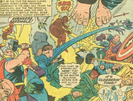
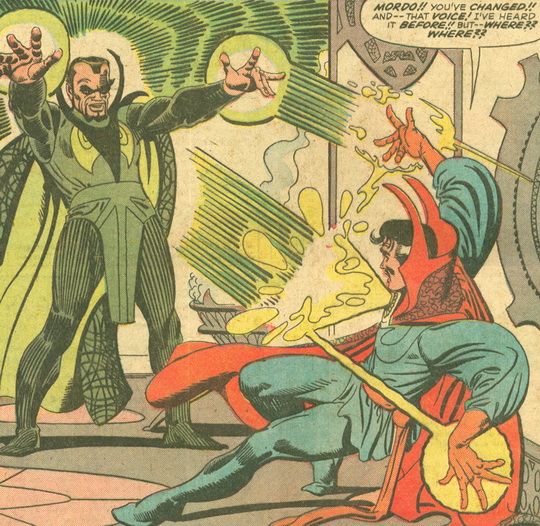
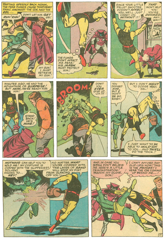
When you have superheroes and super-villains, odds are you will now and then have super battles—or as we like to call them here at the Marvelous Zone, Epic Battle Scenes. In 1965, which of the many will win the Award for the Most Epic Battle Scene?
In the category of Most Epic Battle Scene, the nominees are…
- Fantastic Four Annual #3
- Strange Tales #132
- Daredevil #6
And the Award goes to…
Fantastic Four Annual #3, which reminds me so much of the Epic Battle Scene in Avengers: Endgame. Everybody who’s anybody is there, giving it their absolute best. As the Editor grandly points out, this is “the greatest battle royal ever recorded within human memory—!” ’Nuff said.
MOST DRAMATIC TRANSFORMATION
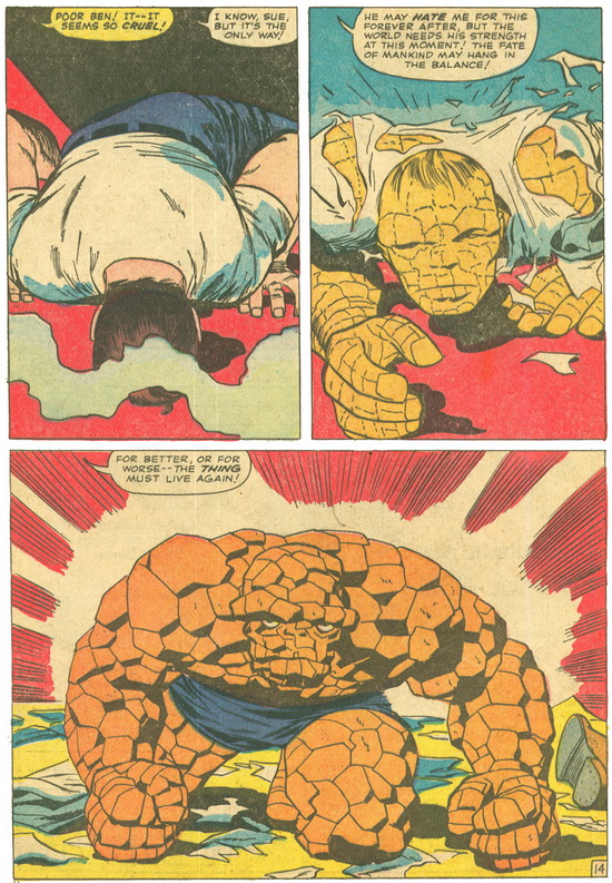
Since many Marvel characters are not what they seem, or not what they once were, transformation is an integral element in many a storylines.
In the category of Most Dramatic Transformation, the nominees are…
- Ben Grimm to Thing permanently
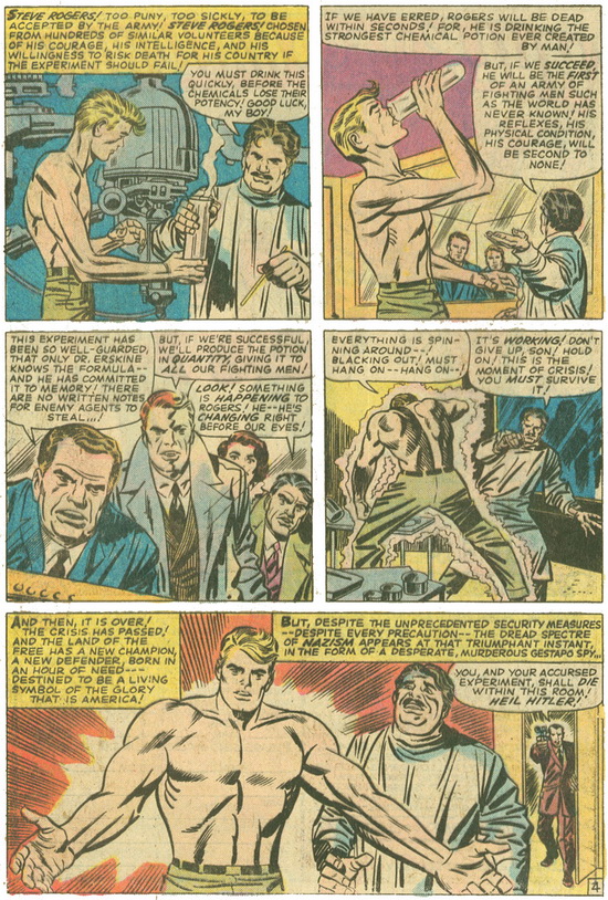
- Steve Rogers to Captain America
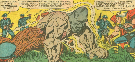
- Absorbing Man to wood, stone and steel
And the Award goes to…
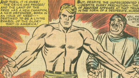
In 1965, I’m liking Steve Rogers turning into a super-soldier so he can eventually become the superhero Captain America. Not only is this a transformation of his body, but also his entire life. This is a seminal moment that must be celebrated.
BEST DIAGRAM OR MAP
Oh goody! It’s the Best Diagram or Map Award! I’m distressed that Marvel is not presenting these with the same frequency as in previous years, but every instance is an opportunity for me to exclaim “Oh goody!” and judge which is the best.
In the category of Best Diagram or Map, the nominees are…
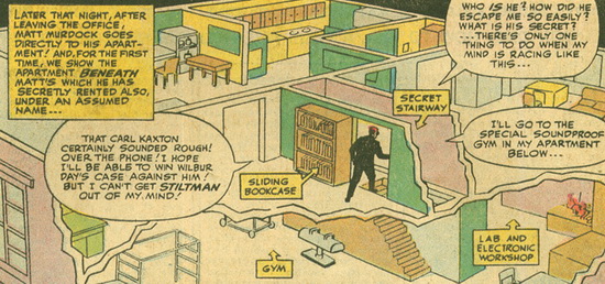
- Matt Murdock’s Apartment
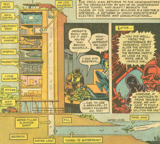
- Organizer’s Lair
- Daredevil’s Billy Club

And the Award goes to…
The Organizer’s Lair, not only for having so many levels, but also for the secret tunnel access through a water-filled elevator shaft. However, why isn’t the helicopter on the roof? And what is the purpose of that penthouse, anyway? More questions than answers, so I guess I’ll have to keep reading!
BEST USE OF PERSPECTIVE
Because I started a sketchbook in my retirement, I am now keenly aware of the importance of perspective when forming a piece of art. So I softly enter here, with reverence and a new appreciation for this artistic concept.
In the category of Best Use of Perspective, the nominees are…
- A Big Eye watches a Tiny Giant-Man
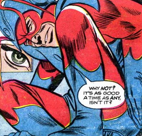
- Namor as he approaches a cave
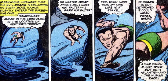
- The view through Giant-Man’s Mask
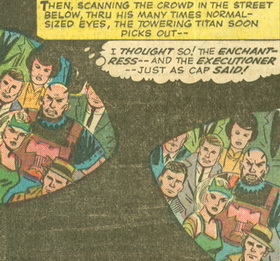
And the Award goes to…
The view through Giant-Man’s mask. Because I have to ask myself: is that really what he’s seeing? And if so, however does he manage it? The darkness around the images of the outside world lends a sense of solitude to the life of a superhero. An excellent artistic portrayal of the superhero’s unique place in the world!
WALKING OFF INTO THE SUNSET (OR MOONLIGHT)
Sunset, moonlight…you get the idea. The superhero comes to the end of a long day of derring-do, and finally has a tranquil moment to sigh and enjoy his inner satisfaction…or ponder his remaining troubles.
In the category of Walking Off Into the Sunset (Or Moonlight), the nominees are…
- Amazing Spider-Man #24
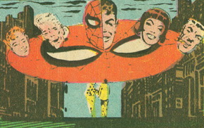
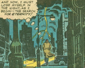
- Strange Tales #134 (Doctor Strange)
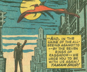
- Strange Tales #128 (Doctor Strange)
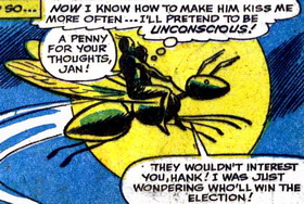
- Tales to Astonish #63 (Giant-Man and Wasp)
And the Award goes to…
Strange Tales #134, as Dr. Strange so dramatically proclaims that he must lose himself in the night and begin his search…for Eternity! He’s not simply looking forward to a warm bath or a cold beer. Truly, a superhero’s work is never done! And how poetically the mystical man’s thoughts are portrayed against this backdrop of dark buildings and blinding yellow car lights, as his trench coat sways dramatically in the evening breeze.
DR. STRANGE PAGING DR. SEUSS
Of all the corners of the Marvel universe where the artists most get to stretch their creative wings, surely the pages of Doctor Strange give greatest opportunity.
In the category of Dr. Strange Paging Dr. Seuss, the nominees are…
- Strange Tales #128
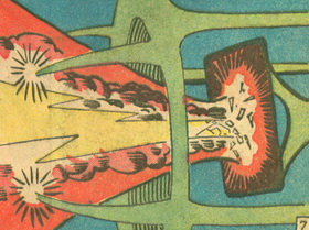
- Strange Tales #133
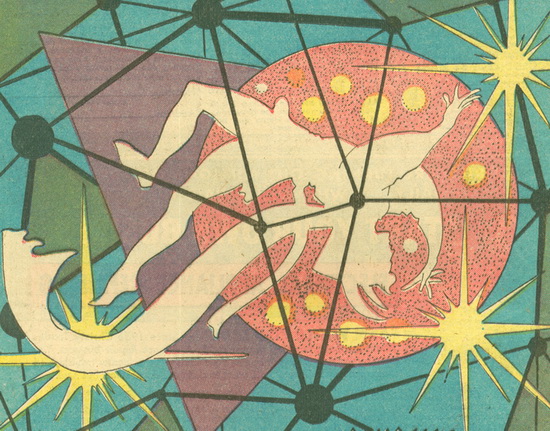
- Strange Tales #138
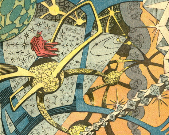
And the Award goes to…
Strange Tales #138, which vividly reminds me of the Quantum Realm of the recent Ant-Man movies. Which also had a highly Seuss-ish quality about them. See how small Doctor Strange appears in the middle of this inexplicable madness! I’ll bet Steve Ditko had fun creating this other-worldly world.
BEST HAIR
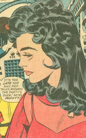
What’s the saying? God only made so many perfect heads; the rest are covered with hair. Marvel has its share of bald beauties, but this Award honors the artistic celebration of hair!
In the category of Best Hair, the nominees are…
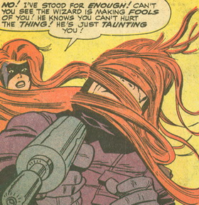
- Medusa
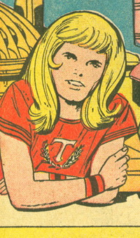
- Boy Thor
- Scarlet Witch
And the Award goes to…
You thought I was going to pick Medusa, right? Her hair truly is spectacular, but somehow, I can’t stop looking at the gorgeous blonde locks of young Thor! As much as I hate to admit it, Sue Storm probably wishes her hair had as much style and bounce!
HOTTEST BABE: FEMALE
As time goes on, I’m beginning to see some improvement in the artistic portrayal of women. I know this will get better, but for the time being, let’s take a look at some of Marvel’s hottest babes in 1965.
In the category of Hottest Babe: Female, the nominees are…
- Black Widow
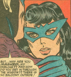
- Wasp
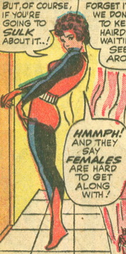
- Enchantress
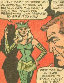
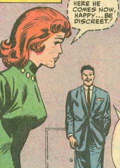
- Pepper Potts
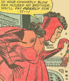
- Scarlet Witch
And the Award goes to…
Enchantress has it ALL going on: the figure, the tight green outfit, the long blonde hair, the inexplicable coverings on her arms (but not her hands or shoulders). And besides—as I may have noted before—it’s sorta in her name to be hotter than all the other girls. So she wins, (bare) hands down.
HOTTEST BABE: MALE
Can a man also be a hot babe? You bet!
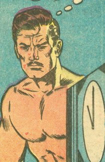
In the category of Hottest Babe: Male (the art award previously known as “Best Chest: Male”), the nominees are…
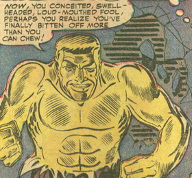
- Molten Man
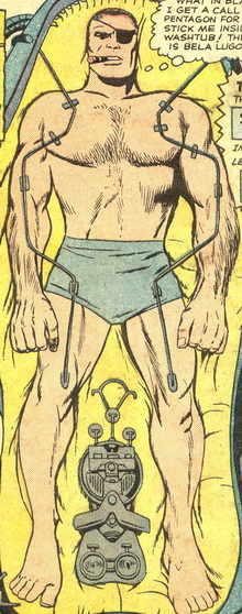
- Nick Fury
- Captain America
- Swordsman
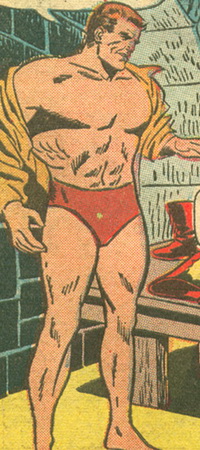
- Power Man
And the Award goes to…
Nick Fury, for rocking his chesty look, not only with huge strong hairy arms and an eye patch, but also the ever-present cigar. Nothing stops this guy, nothing fazes him. He is the picture of masculinity. The only thing I would do differently here is swap his “outfit” (such as it is) with Power Man’s—in the more dramatic color “Power Red.”
IF LOOKS COULD KILL
Some years ago I ran across the phrase “if looks could kill” in Bram Stoker’’s Dracula and wondered if this is the earliest use. If anyone knows the history of the phrase, please share! In the meantime, though Marvel is certainly not the first to employ this concept, they definitely have several good examples of it in their 1965 comics.
In the category of If Looks Could Kill, the nominees are…
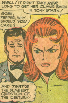
- Pepper Potts, Pissed at Countess Spirosa
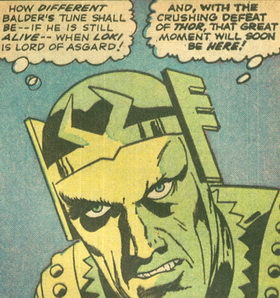
- Loki, Pissed at Balder
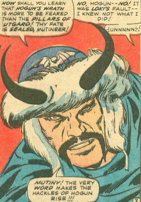
- Hogun, just Pissed
And the Award goes to…
Pepper Potts. Somehow the “if looks could kill” look is much more dramatic on a woman’s face, especially when coupled with the strong emotion of jealousy. Loki and Hogun probably look pissed most of the time anyway, so these examples are not so unusual; but here Pepper wears her heart on her sleeve…or in her eyebrows, as the case may be.
BEST COLLAGE
Making a collage is always a fun art project, and when Marvel does it, not only is it fun, but it also provides a great deal of information in a very small space. Three cheers for the economy of the collage!
In the category of Best Collage, the nominees are…
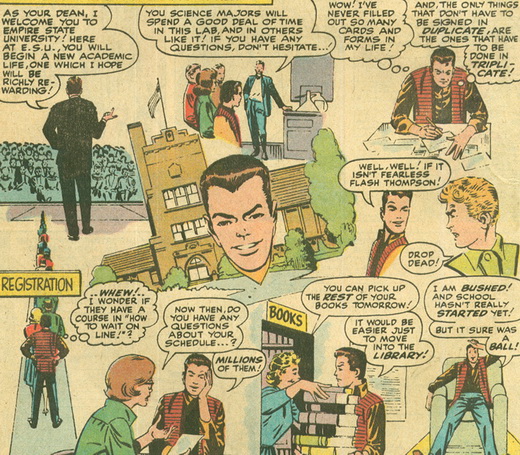
- Amazing Spider-Man #31: Peter’s first day at college
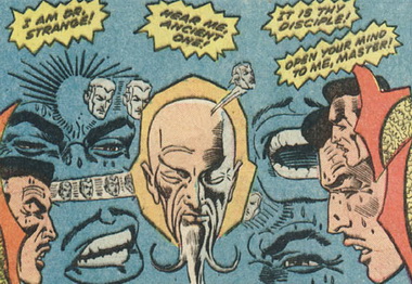
- Strange Tales #137 (Doctor Strange): Doctor Strange probes the Ancient One’s mind
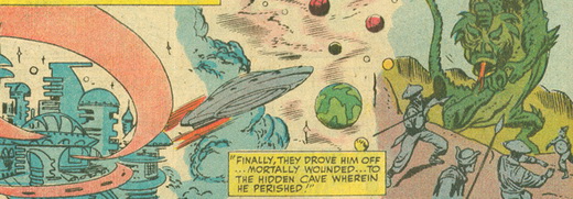
- Tales of Suspense #62 (Iron Man): Axonn-Karr’s adventures
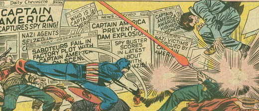
- Tales of Suspense #63 (Captain America): Newspaper headlines
And the Award goes to…
I simply love the artistic depiction of Peter Parker’s first day at college! It reminds me of one of those 1980’s school comedies. Can’t you just hear Wang Chung playing in the background?
MAYHEM IN THE STREETS
We couldn’t get through these Art Awards without addressing Marvel’s marvelous capacity for capturing the chaos that the clash of superheroes and super-villains unleashes upon the unsuspecting public.
In the category of Mayhem in the Streets, the nominees are…
- Amazing Spider-Man #25
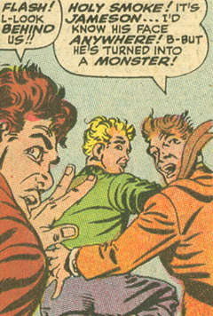
- Journey Into Mystery #113
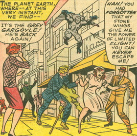
- X-Men #9
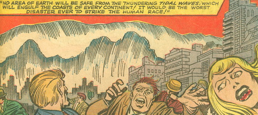
And the Award goes to…
X-Men #9 has it all. In the background, thundering tidal waves threaten civilization, and in the foreground, the expressions of innocent bystanders perfectly capture what this Award is all about. It doesn’t get much better than this.
MAYHEM IN THE OFFICE
Not content with Mayhem in the Streets, the Marvel Bullpen has been experimenting with the idea of moving the mayhem into the workplace. And so far, they’re doing a stellar job of it!
In the category of Mayhem in the Office, the nominees are…
- Amazing Spider-Man #20
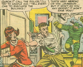
- Strange Tales #139 (SHIELD)
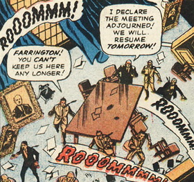
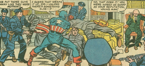
- Tales of Suspense #62 (Captain America)
And the Award goes to…
Strange Tales #139. With their world collapsing around them, a frantic employee admonishes the boss with “You can’t keep us here any longer!” The boss agrees, but feels compelled to add, “We will resume tomorrow!” Hello! If the building is still standing tomorrow! If we aren’t all dead tomorrow! Have you ever had a boss who doesn’t know when it’s time to quit? This kind of attitude only adds to the mayhem.
SILLIEST IMAGE
The Marvel Bullpen always seems to be having so much fun with Art, and where is this more apparent than in their propensity to create some of the silliest images imaginable?
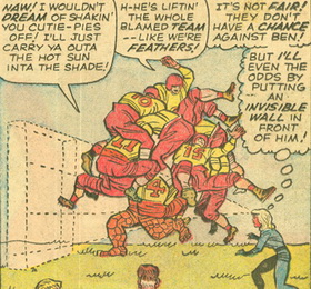
In the category of Silliest Image, the nominees are…
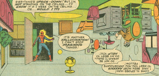
- Amazing Spider-Man #24
- Fantastic Four #35
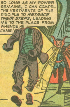
- Strange Tales #128 (Doctor Strange)
And the Award goes to…
Once again, the Spider-verse takes the prize! From a very young age, I would lie on the floor looking up at the ceiling and wonder what it would be like if everything was upside down. Apparently, the creators of Marvel have engaged in similar fantasies. This image speaks so strongly to me, and if you are being honest, it also sparks your own childlike imagination.
BEST PAGE LAYOUT
From small artistic touches like an expression, chest or hair, to the much larger decisions that affect the overall look of a page, let us now turn our attention to the Best Page Layout.
In the category of Best Page Layout, the nominees are…
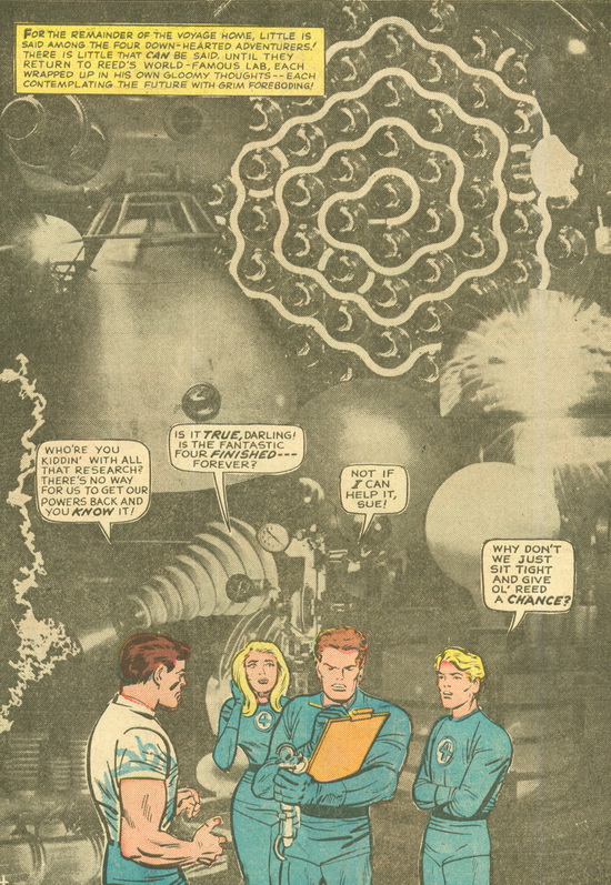
- Fantastic Four #39, with a photographic background
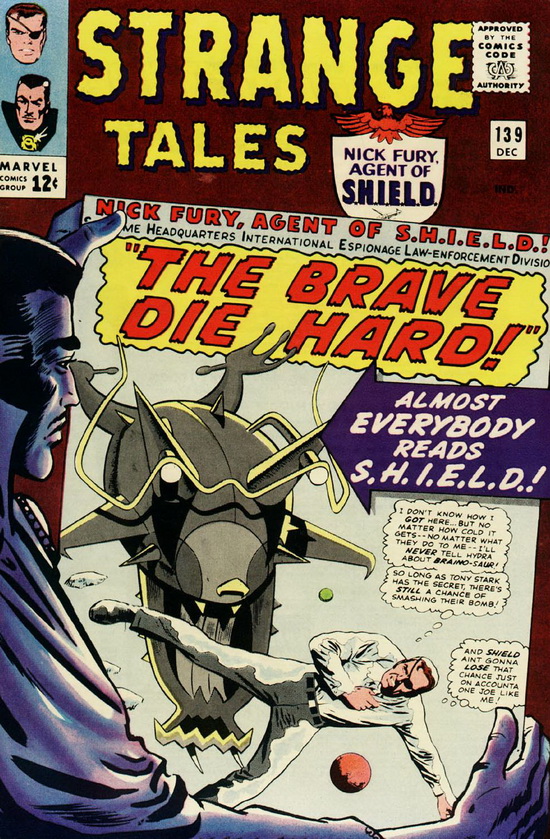
- Strange Tales #139, where Doctor Strange views the SHIELD splash
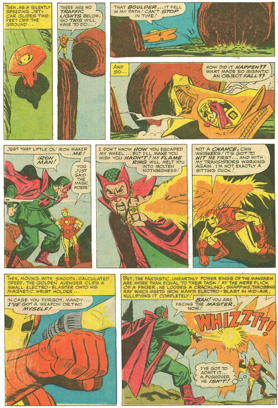
- Tales of Suspense #62 (Iron Man), with staggered, creatively placed panels
And the Award goes to…
Strange Tales #139. Always a fan of the “Fourth Wall,” I’m enamored by the idea of Doctor Strange looking at the cover of a Marvel Comic. This particular piece of art reminds us that it is all art, and I respect the artists for their artistic decisions. Bravo!
So now, as we come to the end of the Art Awards and I have expressed my respect for the artists of Marvel, we next turn to the writers, where again I am sure I will express much respect in the granting of Awards. Though surely we’ll discover some booby prizes along the way, as well? Tune in next week to find out, as we come rapidly to the final stretch of these 1965 Marvelous Awards!!


